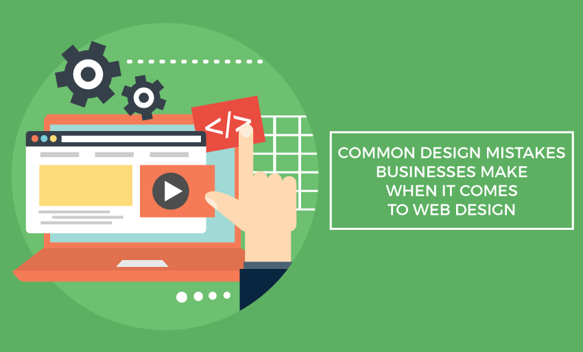
Common Design Mistakes Businesses Make When It Comes To Web Design
Nowadays, a unique and compelling website is not an option anymore. Having a poor website can cause businesses to lose customers, and that is money out the door. Many small business owners design their own websites to save money and have more control over the project. Unfortunately, sometimes they do not truly understand the basic concepts of good website design which leads to a website that is less than ideal.
Website design is a form of art and like art web design looks to give its viewers an experience. Web design is meant to combine form and function in a way that makes a website that is enjoyable, navigable, interesting and usable. To do this, there are certain spoken and unspoken rules that the web designers must follow. Often, most of the people do not follow these rules, and that’s when websites like this happen. These are most of the common web design mistakes that small business owners often make.
Below you will find most of the top most common web design mistakes and how to keep them from hurting your site’s overall engagement;
- Too much going on:-
- It is very common that visitors who cannot understand what your website is about within a few seconds of arriving on your website will leave.
- It is the main thing that every businessman has to keep in mind.
- Also, a crowded website is never a good thing.
- Websites having tons of images, text, and other things going on will take a lot of time to load and they will also confuse customers or visitors visiting your website.
- So, try to avoid busy designs.
- Too little going on:-
- Websites with next to nothing on them are on the other end of the spectrum.
- Websites which are simple in design is a huge trend right now, and it works when done correctly.
- Some small business websites are overly confusing and leave too much to the imagination. That is one of the other big mistakes.
- Your visitors want to know about your business, who you are and what your business can do for them.
- So relying too much on simple imagery with no clear direction will leave your visitors guessing about your business and that is not a good thing.
- Too confusing:-
- Somewhere in the middle of the too much and too little lies the great feared confused brand website.
- The confused website is one which features a variety of typefaces, images, color palettes, and themes, none of which relate to each other.
- It usually occurs when you do not have a good idea of your brand image.
- Any person can fall into this trap when you like too many templates and want to use them all.
- When designing a website, choose one theme only, one logo only, and one typeface too, and stay them across all other aspects of your website.
- Poor use of content and white space:-
- Content is the main crucial part of your website and marketing campaign.
- Content is what tells readers about your business and the products or services you offer.
- Give careful attention to the fonts you choose and how the content is laid out on the page.
- Make good use of white space to bring the eye to your website and make a large block of text less intimidating.
- Incorporating too much text into their websites is a big mistake many people make.
- Break text up where you can, and use visual elements to represent concepts where ever possible.
- Therefore, content should always be updated otherwise the customers might think that you have gone out of business.
- Ugly or irrelevant images:-
- Photos and graphics are also one of the main integral part of your website design.
- Images can convey thoughts quickly without having to physically read the text.
- Many businesses inexplicably use irrelevant images or low-quality images. Images that are not of the highest quality will muck up your website and turn off visitors.
- Irrelevant images will only confuse your visitors or readers, making them wonder that what you are trying to convey.
- Ads in all the wrong places:-
- Advertising is a necessary evil in the web design world especially on the blogs where it is regarded as one of the main income streams.
- However, too many ads or noisy and flashy ads will frustrate your visitors and make you lose business.
- Analyze your ads like a hawk, if they are annoying you even in the slightest, they will undoubtedly do the same to your visitors.
- Try to pay extra attention to pop-ups.
- While they are generally making a comeback, make sure that they are easy to close and not full-screen size.
So always keep your target audience and brand images in mind in every step of the design process from planning to post-launch analysis. If you can reconcile, then you will have a beautiful website that speaks volume about your business.